Notes on the Art
Hi there, my name is Marc and I got to work on the pixel art for Poizone back in 1991. We thought it would be fun to write down a few things about the art process in order to add to the games’ documented history.
INSPIRATION
As Paolo mentioned before, the core game was inspired by the classic Pengo arcade game. But in addition he had the great conceptual idea to make it about cleaning up toxic elements from a variety of locations around the world and beyond.
The concept was pretty high level and we kept it loose, but it helped us tie things together. The block destruction rules might not all make sense from an ecological point of view, but are recognizable and work within the confines of the game (throw beakers against other blocks to break, crush spray cans vertically, don’t move the jelly etc.).
ART STYLE
The art style was inspired by a combination of demo scene graphics and 16 bit arcade games, we are talking bright colors and metallic highlights. We had a fixed system palette of 256 colors at our disposal. Impressive for the time, but it did still provide some creative constraints.

TOOLS
My favorite sprite editor on the Archimedes was a program called !Arcol. It was perfectly streamlined and the minimal GUI would get out of the way. This was especially crucial when working with a limited screen resolution of 320x256.


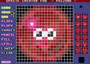
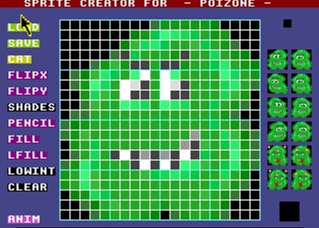
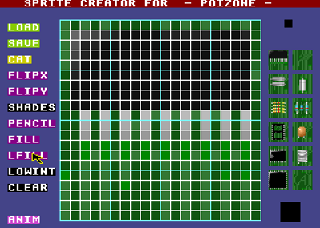
At the same time, Paolo had the foresight that a more targeted editor could make our in-game assets creation pipeline more efficient. Especially since we were working on a grid and all characters, blocks and background tiles were based on 20x20 pixel squares. He created !Spriter, a 20x20 pixel editor featuring sprite sheet animation. This streamlined our asset creation tremendously, not just for painting and animation, but also for overall asset management.

Paolo also created two level design tools:
- !LandEdit was used to lay out the background blocks for all 5 lands. Since all levels had the same size and layout, this was pretty much a cosmetic task.
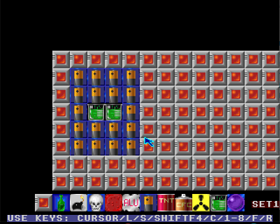
- !SchemEdit was the name of the tool used to arrange the dynamic block layouts and constructs in all 50 levels.
ASSET BREAKDOWN
Title Screen:
The title image was rendered using Rayshade, a text based open source raytracer which had been ported to RiscOS. Creating such a render using only basic geometric primitives (cubes, spheres, cylinders, triangles, cones) was a fun challenge and required some visual tricks.
I could mainly get away with it because the final render is very low resolution and not animated. For example, the penguin consists of a black cylinder topped by a black sphere. In order to get the white face and belly, I added some white primitives with a slight offset to clip the black surface.
To this day, I don’t know why there are some shading artifacts on the ground in the bottom right corner, but since it took about a day to render this scene and I was so excited by the result, I never had the courage to dig deeper into it.
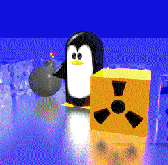
I did some minor retouching in !Arcol (for example the specular highlights on the eyes). The gooey Poizone logo on the title screen was created in !Arcol as well:

In-game:
- Characters: move and stun animations were kept very simple and cartoony, it was fun creating those in !Spriter.

- Moving Blocks: just like the characters, the moving blocks were 20x20 pixel sprites, but they didn’t require animations. In order to make them appear more blocky, we did not use any alpha on those assets. This also helped greatly with performance.

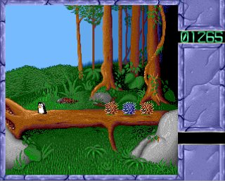
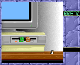
- Lands tiles: each environment started with a single background tile in !Spriter to create a repeating background pattern. That tile was then duplicated and slightly adjusted on the inside for variety. Preserving edges guaranteed that tiles would always match up.
ICE LAND

SPACE STATION

THE MOON

JUNGLE

RISC COMPUTER

- UI: since we were working with a fixed screen size, the UI was pretty straightforward. Adding a frame all around and blocking out the area on the right for scores etc. helped reduce the game area enough to guarantee smooth scrolling even on lower end ARM2 computers. As a side note, the cracked stone/ice style of the UI was inspired by the game Eye of the Beholder 2 which was featured in all the glossy game magazines at the time.
Cut scenes:
We added little cut scenes as transitions between the lands. For these transitions, we decided to bust the characters out of their blocky world and let them evolve in spaces with slightly more expansive sight lines and interesting perspectives. We wanted to give players a glimpse of a wider open world.
I used !Arcol to create these larger image elements and Paolo worked his code magic on particles and custom character paths.

THANKS
I want to extend a special thanks to Paolo for taking me on this journey, and for bringing back all those memories with this awesome port of Poizone!
Leave a comment
Log in with itch.io to leave a comment.